
Stop Writing Walls of Text. Use AI to Add Visuals in Minutes
This is my go-to for turning ideas and long text into visuals you can use in posts and presentations

Hey, Diana here!
I’ve decided to take this Substack in a new direction. One I’m genuinely passionate about: writing with AI.
But not in the way you might think.
I’m not talking about letting AI do everything while I hit publish. I’m talking about a real process where you stay in the driver’s seat, build systems to write more without sacrificing quality, repurpose your long-form posts into other formats to expand your reach, do it all consistently without burning out, etc
Write first. Prompt smart. Scale everything.
That’s why I’m renaming this Substack to Write, Prompt, Scale.
Every post will be about building smarter AI writing systems — not replacing your voice, but amplifying it.
If this sounds like a journey worth following, support me by becoming a paid subscriber :)
One of my biggest challenges when learning complex topics is that some posts feel intimidating.
Most of them have only text!
I’m a book lover. I enjoy reading. But when it comes to learning new stuff, visuals help anyone grasp complex ideas more easily.
So today’s topic is how to quickly create visuals for your posts.
But not the old way. You won’t have to spend hours making them yourself.
I’ll show you how to do it the AI way with a tool called Napkin.
Napkin is by far my favorite tool for generating visuals. With a click, you can turn paragraphs from your post into gorgeous infographics, charts, and more!
It takes less than a minute. No slop. The free version is enough (at least for me).
Here’s how to use Napkin (and more importantly, when to use it).
How to turn text into visuals with Napkin
Just go to Napkin and create an account. Then follow these steps:
Click on New Napkin
Select Blank Napkin
Paste your text (you can also draft with AI using Napkin)
I took the headings and main ideas from this guide and gave them to Napkin:
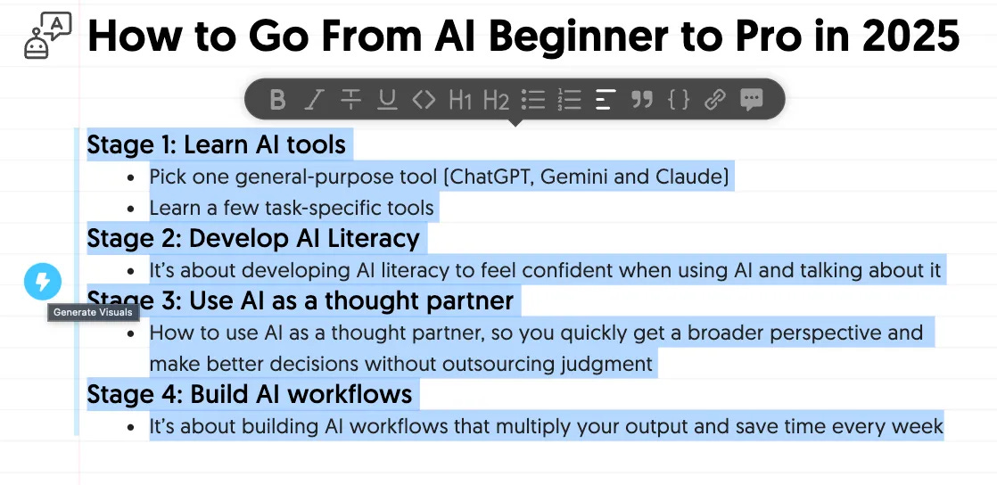
We just have to select text, and a “generate visuals” icon will pop up on the left.
Click on it, and Napkin will suggest some visuals.
Here’s a video demo:
You can choose visuals from any of these categories: brainstorming, mindmap, process, business frameworks, comparison, data, problems & solutions, parts of a whole, cause and effect, hierarchy, visual metaphors, narrative, and timelines.
When to add visuals to your posts
Here are the best ways I’ve seen writers use these visuals:
Turn complex ideas into easy-to-understand concepts
Bring abstract ideas to life
Help your Substack notes stand out
Make posts more fun (this is a personal opinion 😅)
Here are some examples.
The PyCoach uses Napkin visuals to draw more attention to his Substack Notes. In the example below, he added a Gantt chart to help people visualize his 15-week AI learning plan.
He also uses visuals to bring abstract concepts to life. In the example below, he turned the Claude Code architecture into a diagram.
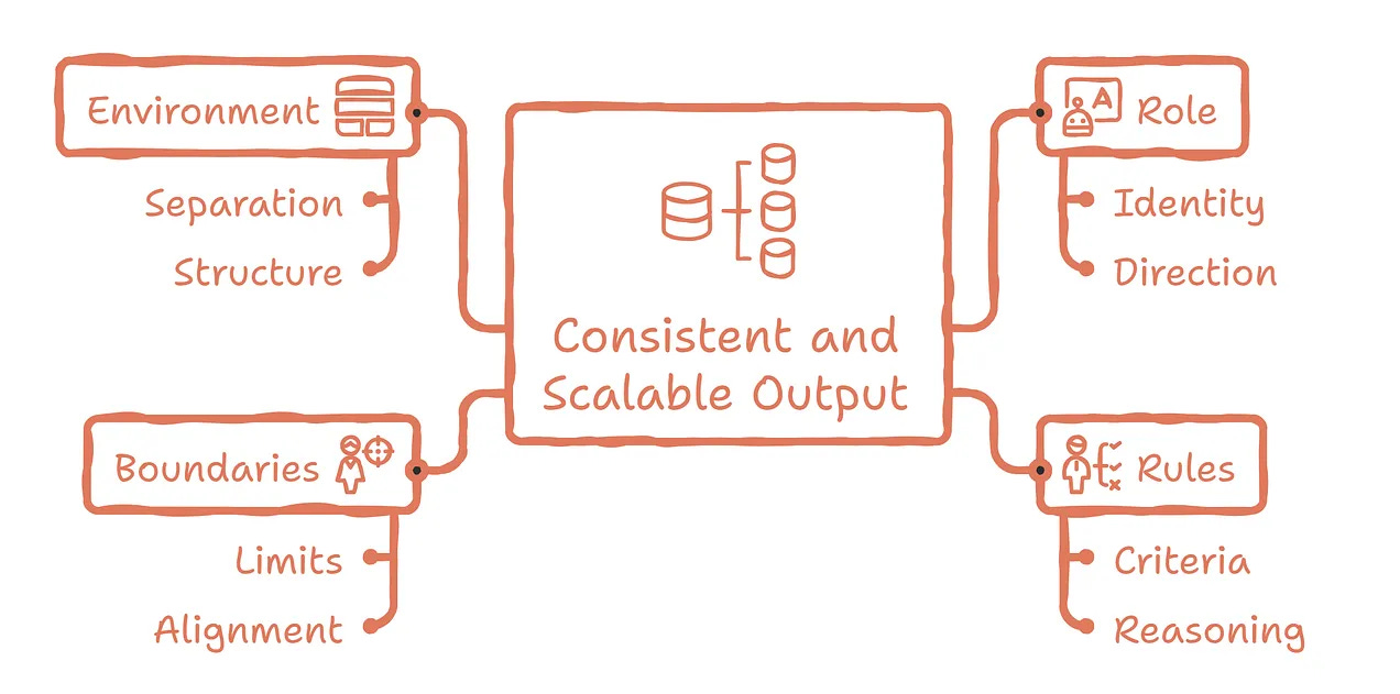
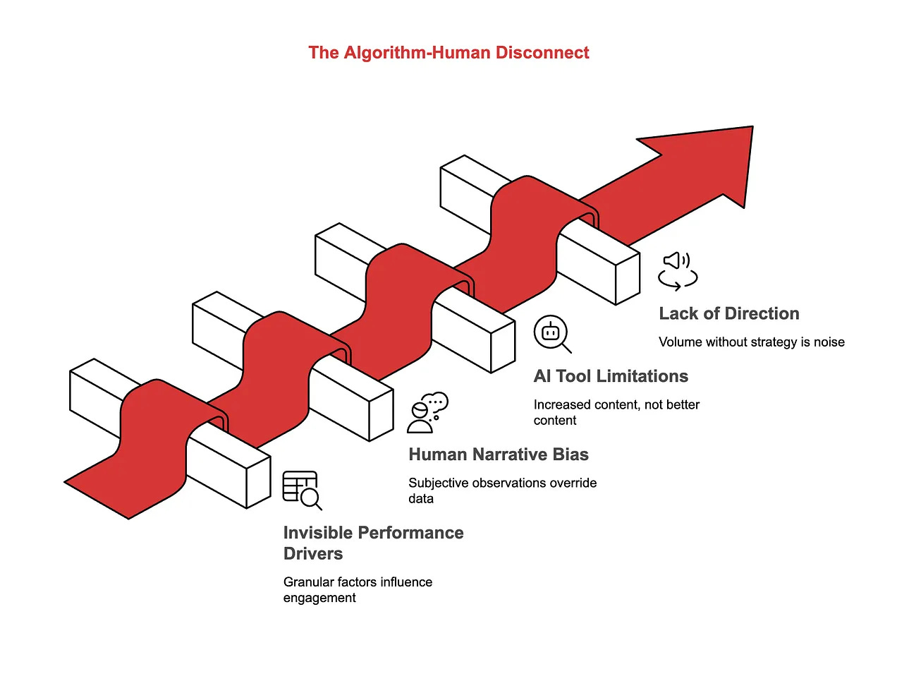
Kamil Banc is another Substack writer who uses these kinds of visuals a lot!
In many posts from AI Adopters Club, you’ll find visuals like this one
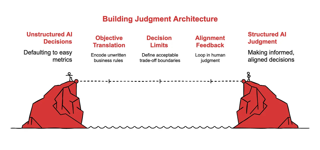
or this one to show the judgment architecture journey.
I think Kamil uses the paid version. The white and red in his images match his Substack brand colors, which I think is a paid feature.
As for me, the free version is enough.
Free Napkin users get 500 AI credits per week, which has been plenty for me so far. Paid users get 10,000 AI credits per month, three brand styles, and more.
If you found this useful, give it a like and share it with others.
Happy writing :)
visuals and cutting down the fluff of text has been a game changer. it’s much better these days
What a great find! I was looking for one of these and finally slugged through Canva's impossible workflow for hours... and that could have been a few minutes? But now I have more uses for this! You just watch.